Visual ASO Optimization Of The Application And Its Impact On Conversion
Why visual optimization of an application is so important and how it affects conversion - practical cases and theory of graphical ASO
Visual elements continue to be the primary factor influencing a user's decision to download. If a user is looking for an application based on the necessary functionality (there is no loyalty to a particular brand), then looking at the search results, he is more likely to perform a targeted action focusing on the visual components, namely the icon and screenshots. This one was written by the service experts: https://asolytics.pro/.
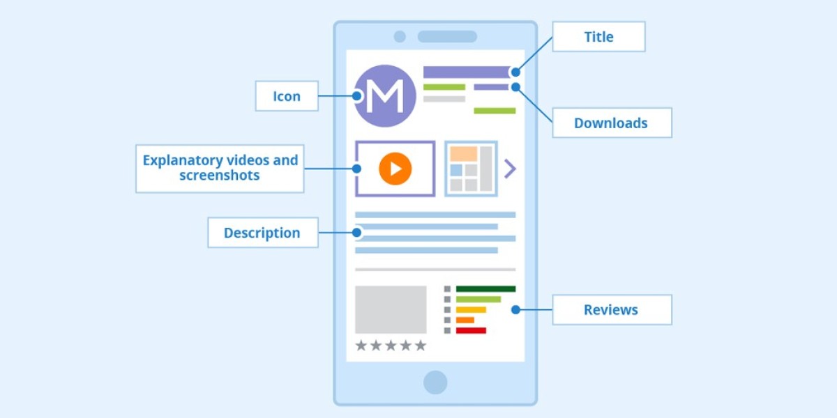
Screenshots and icons are the visual elements of the application, which are of great importance and influence the conversion rate
In the case of a mobile application, conversion is the percentage of the user installing the application after viewing its page in the store. The average rate at which users download apps after viewing them varies by category and is roughly 29.68% in the Google Play Market and roughly 32.53% in the App Store in the United States. Conversion does not apply to your application's views from the search results. The app stores can track several types of mobile app conversions.
In the App Store, we are talking about:
- App Units / Impressions — conversion from showing the app in search results to installation
- App Units / Product Page Views — conversion from viewing the application page to installation
- Product Page Views / Impressions — transition from displaying the application in search outcomes to accessing the application's page.
For Google Play, we are talking about:

Tracking downloads from Google Play market registers the user's application download.
Conversion Tracking for Initial App Launches: When a user who has installed your app by clicking on your advertisement initiates the app for the first time, this action is recorded as a conversion. This feature is also supported on iOS devices.
Primarily, the growth of these indicators is driven by the application icon and the presentation of its screenshots, which are critical graphic elements.
An icon is an element of visual optimization displayed in the market or store search results and on the application page. It represents a thumbnail image of the game, a functional or branded part of the application.
Typically, icons feature a simplistic and straightforward design, which makes sense since the icon needs to communicate information to the user directly from the search results, where it appears as a small image among numerous other similar apps.
Application Icon
This graphic element should be considered because it is responsible for the first impression of the application. Typically, icons are designed to be straightforward and uncluttered, which makes sense since the icon needs to communicate information to the user within the search results, appearing as a small image amid numerous other comparable apps.
The primary approaches to icon design include:
- Icons featuring the name or fragments of the name of an app or game (studies indicate that merely 25% of developers include textual elements on their icons)
- Logos embedded within icons to foster unmistakable brand recognition
- In-game symbols are integral to the play experience, representing either the protagonists or the gameplay mechanics.
Occasionally, the preferences of users align with the perspectives of the developer, designer, or app store optimization (ASO) expert. Consequently, incorporating A/B testing services for visual components is essential in the app promotion process. Google Play Market offers Play Store listing experiments in its console to evaluate the impact of new elements on conversion. There is an opportunity to test up to 4 variants of graphic elements simultaneously (the current version + 3 more).
Screenshots Of The Application
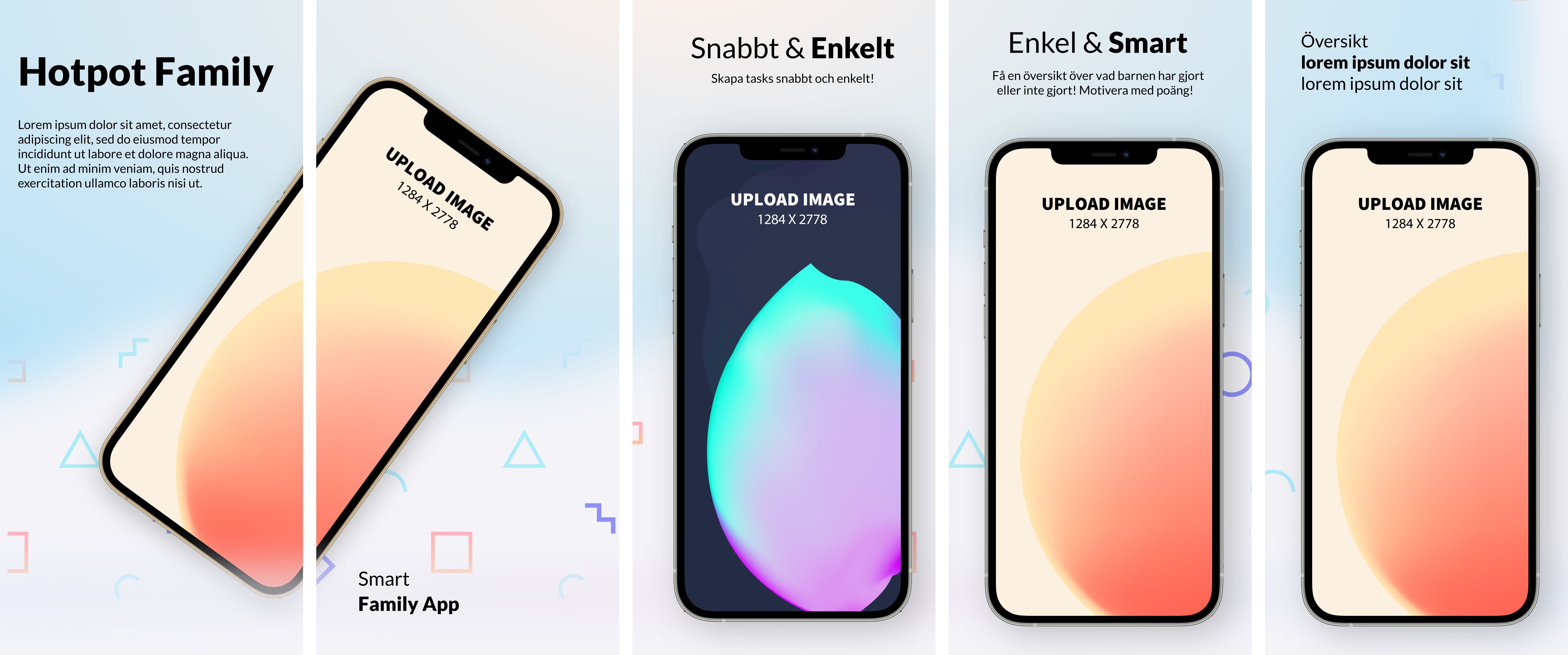
This is a great opportunity not only to familiarize the user with the main functionality of your application - its capabilities and features but also to influence the conversion directly. When making screenshots, take the chance to appeal to the user with calls to action (call-to-action), draw his attention, and encourage him to download. The content within this image is not searchable as it is embedded in a graphic and not indexed as text.
There are two main types of screenshots of the application - horizontal and vertical. Most often, the screenshot itself determines the design of the application. Games often have a horizontal orientation, and turning them into vertically designed screenshots is pointless.
Vertical screenshots are more informative and, without unnecessary actions from the user (without scrolling), show more data about the application at a glance. They may include an image of the device, or they may not.
Screenshots presented in a horizontal orientation are commonly utilized in video games to provide an in-depth look at the core gameplay mechanics to the player. Still, due to the display features (only one screenshot, respectively, a maximum of one inscription), the percentage of users who view the entire series of screenshots is relatively tiny.
The design of screenshots depends very much on the application category. For example, we are talking about applications for presets, filters, and photo effects. In that case, screenshots are usually designed at the highest level, which will indicate the quality of the application.
Sometimes, it's surprising how "simple" the visual optimization of famous brands' apps looks. This, of course, is explained by the fact that users know exactly what they are looking for and will download the application without looking at the design of its page. However, even popular applications pay attention to such a channel when working with the user.
The conversion dynamics is the leading indicator of high-quality visual optimization of the application. The visual elements (icons and screenshots) increase the application's attractiveness for the user and lead to installation. Text optimization and working with semantics have their purpose - the visibility of the application in the search. When the algorithm generates the search results based on the user's search query, the application is selected for download by the icon and, in the case of viewing the application page, by screenshots.